Location weather verification use cases
Compare performance
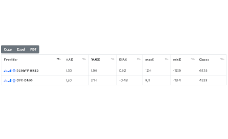
You want to know the details as to how good the forecasts perform for a particular location.
Table by provider Demo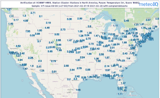
Analyse geographic distribution
The forecast performance is not the same everywhere. Use maps to understand geographic differences.
Map of score Demo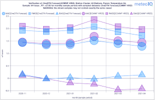
Continuously monitor your KPI
Understand how performance evolved over time and compare with performance of numerical weather prediction models.
Chart by sample period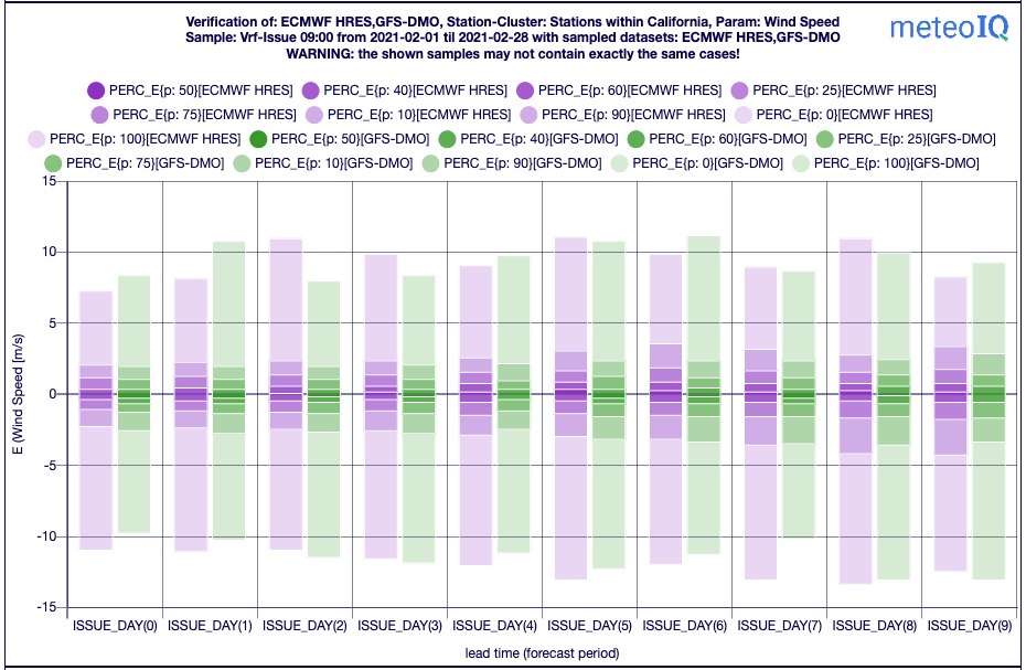
Understand error characteristics
Different forecasts can be compared to each, for example by visualising the error percentiles over leadtime.
Chart by leadtime Demo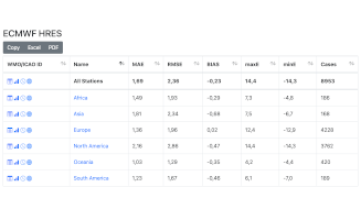
Overview per provider
Get an overview of the forecast performance for different providers.
Table geography Demo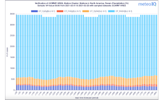
Contingency matrix
For categorial forecasts investigate contingency matrices.
Contingency chart Demo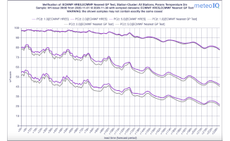

Provide your ideas
We are looking forward to hear about your requirements and implement them.
Contact us